
Ashworth & A Dragon
Here is the current drawing I'm practising on for colour.
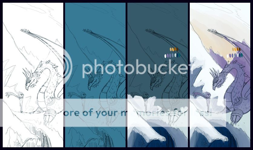
What do you guys think of the colour palette? Did I get it right? Too COOL? Too BLAND?
Anyways I'm going to give it a go. Thanks for all the feedback posted on this 'Learn How Colour Works' blog. I'll try to get back to your replies as soon as I get the free time to do so! Thanks again!
Colours: A Mystery?
I can't believe this... Purplekecleon completely changed the way I look at colour. Why haven't I seen this concept 10 years ago? I reckon that if I had full grasp of the concept on how
colour works my artwork would have SIGNIFICANTLY improved.
It's amazing. I read through
 's tutorial on 'how colour works'. If you're are curious please check it out right here: :thumb184642625:
Reading through her tutorial really made understand a few important things.
That last point was a big one for me. When I went to work at the casino, the day after I finished reading up on Purplekecleon's colour tutorial, I was looking out of the giant windows of the VIP room. It was an afternoon Summer setting. Outside was a split between the concrete carpark (that was loaded with a diverse range of colourful cars) and a beautiful park complete with lush trees, grass and a lake. The sky was starting to glow into a twilight reddish/purple colour. As I was embracing the scenery I thought about how LIGHTING affected the colours of objects. Then I saw the grass... It wasn't green grass any more (it was when I arrived at 2PM for the start of my shift), no. The grass turned cyan/purplish... At that moment I was like: "Woah!" How did that happen?? Then it hit me... The colour of the sky and clouds affected and determined how the colours became of the park. Even the lake turned from a murky dark navy blue into a lavenderish dark purple! It was incredible.
Anyways because of that experience I started to see how colours working indoors. Working in a casino there were slot machines all over the room - you know the ones with the neon lights? Then I looked at every object (including humans) see and how the light from the machines bounced off them to create a different colour set. It was crazy. I even looks at the carpet, the chairs, the tables - everything... It completely changed how I see colour.
The moral of this story? After reading Purplekecleon's tutorial on colour I was completely stoked on how I missed out on some important fundamentals on how colours work. Colour can make a boring picture become a beautiful one. I'm going to see if I can apply what I've learnt from this experience.
In fact I'm beginning to understand why artists like


 &
&  can colour so damn well.
Anyways here's a progress shot on what I'm working on right this instance. I want to study how WARM and COOL colours can work with this latest drawing I'm working on inspired from
 SilverxBlaze drawing :thumb266660651: I want to see if I can really pull this off and produce something good with just the FOUR colours used in the drawing below.
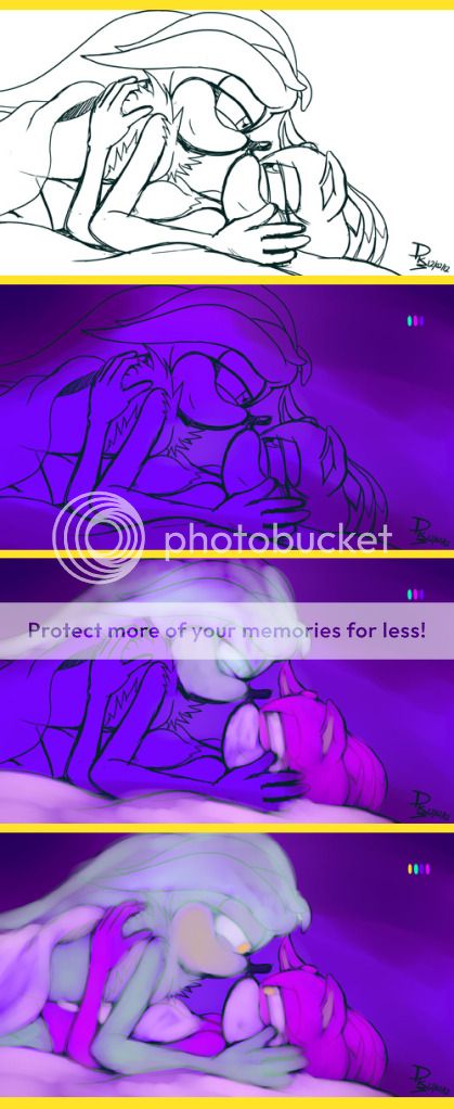
I shall post the result tin full later in the morning. I'm loving every moment of learning how colours work right now! And so should you!
Don't forget to check out
's gallery - she's loaded with not only incredible works of art, but also, works of art that are great reference material for those who want to study colour in depth! *thumbs up*